
Almost all people, including some women, think that pink is for girls only, would it be fashion trends or interior trends.
I’ve been studying colour psychology during my spare time for several years now, and during my research I found this 1918 interesting article about pink shades: ‘The generally accepted rule is pink for the boys, and blue for the girls. The reason is that pink, being a more decided and stronger color, is more suitable for the boy, while blue, which is more delicate and dainty, is prettier for the girl.’
Whaa wait what? Pink is for the boys? Would you believe it?
Pink is associated to red’s family, which is dominating, strong, stimulating. But pink colour can be taken as both calming and active colour, depends how strong or pale pink colour is. Pink, if added more white, becomes feminin and soft. If we take fuschia or magenta, it becomes dominating and strong.

Little Greene, one of my favourite luxury and historical Great Britain paint company launched Pink Paint Limited Collection.
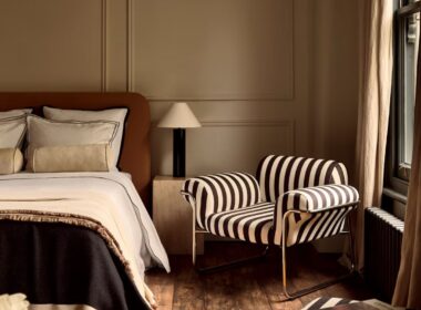
Little Greene “Blush”
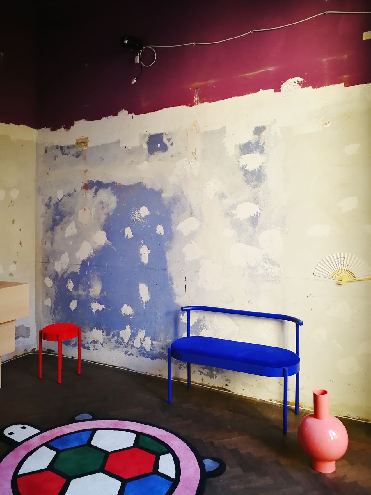
Blush colour can be perfectly combined with darker bolder colours. As we can see in this image, Blush is combined with Cordoba red and it creates a fantastic, chic and a little bit Midcentury modern look.

Little Greene “Confetti”
This year’s top pink. Can be seen in lot’s of brands, Little Greene is not an exception. Perfectly pairs with dark colours.

Little Greene “Dorchester Pink-Mid”
It was used in the Dorchester Hotel in London during the 1960s. A classic pink shade.

Little Greene “Hellebore”
Dusty pink with the presence of a muted violet note.

Little Greene “Hortense”
Gentle lilac colour – calming and beautiful pale pink.

Time for some deeper reds
Little Greene “Cape Red”
Funny, active red colour tone. Use alone for maximum impact or as a powerful highlight within a muted scheme.

Little Greene “Cordoba”
This wooden aubergine tone is perfect for dramatic interiors.

Photo source: www.LittleGreene.eu
What are your thoughts about this “Little Greene” collection?
I know you have some questions about your interior. I can give out some of my time by helping you to choose the best design service for you.
[supsystic-form id=9]Still don’t know if we are the perfect fit for each other?


Beautiful colors, Aida. Thanks for sharing!
Thank you Julie! 🙂